Introduction to the Project
Creating a project for our portfolio can be a highly effective way to showcase our skills, especially for those new to the field of data. The entire report was built from scratch within a few hours with the goal of showcasing newcomers how they can use their personal data to create a project too.
In the realm of professional networking and business analytics, merging LinkedIn data with Power BI opens up new avenues for insights and decision-making, from monitoring the success of networking tactics to comprehending the engagement metrics of our posts. I will walk you through every step of the process, from preparing your LinkedIn data to designing a dynamic report.
Table of Content
- Guide to Creating Your Power BI Report with LinkedIn Data
- Importing LinkedIn Data into Power BI
- Why does the datamodel look like an Octopus!!
- Designing Your Report
- Downloads
- Conclusion and Next Steps
Guide to Creating Your Power BI Report with LinkedIn Data
It's critical to have your tools ready before beginning the dashboard creation process. Hopefully, you already have the Power BI desktop already downloaded. The other requirement is data to play around with. LinkedIn offers a wealth of personal information that can provide valuable insights. You can export these directly from LinkedIn's settings, including your connections, messages, and activities. This data will serve as the foundation for our Power BI report.
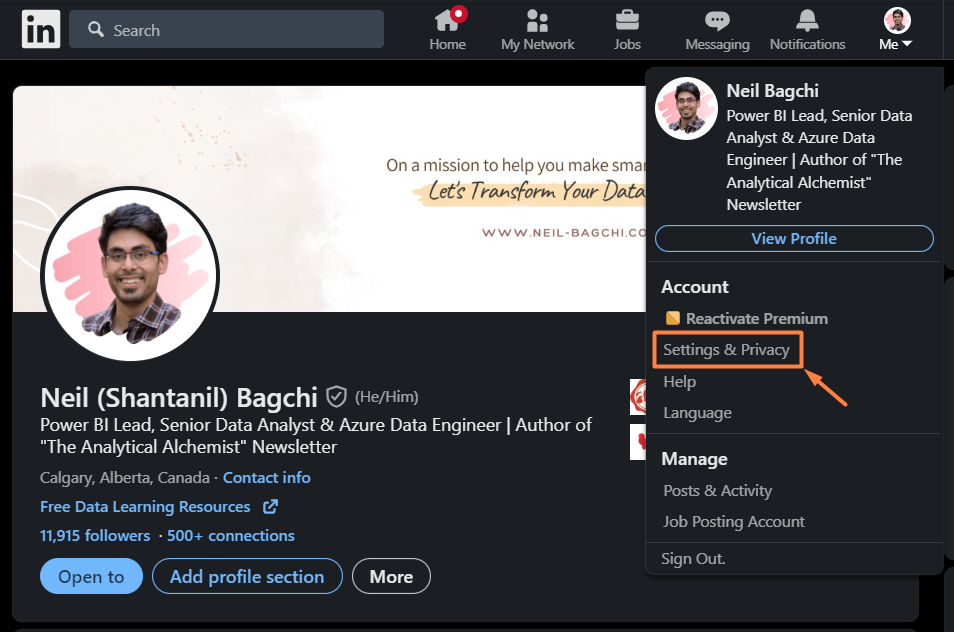
- Log into LinkedIn and Access Settings: The initial step requires you to log into your LinkedIn account and navigate to the "Settings & Privacy" option under the "Me" dropdown menu.
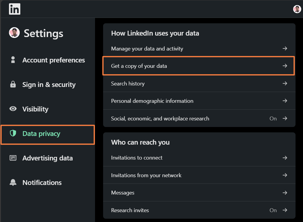
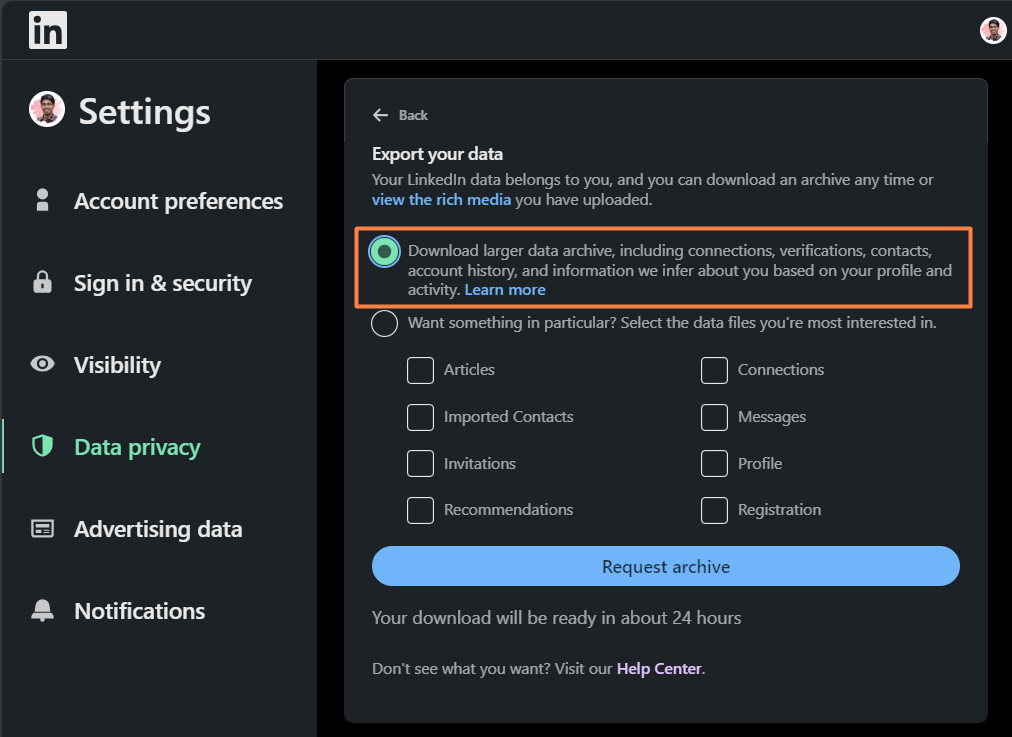
- Request Data Archive: In the "Data Privacy" menu, you'll find "How LinkedIn uses your data" which includes the option "Get a copy of your data." This will let you request a partial or full archive of your LinkedIn data. Opting for the full archive is recommended if you aim to conduct a comprehensive analysis.
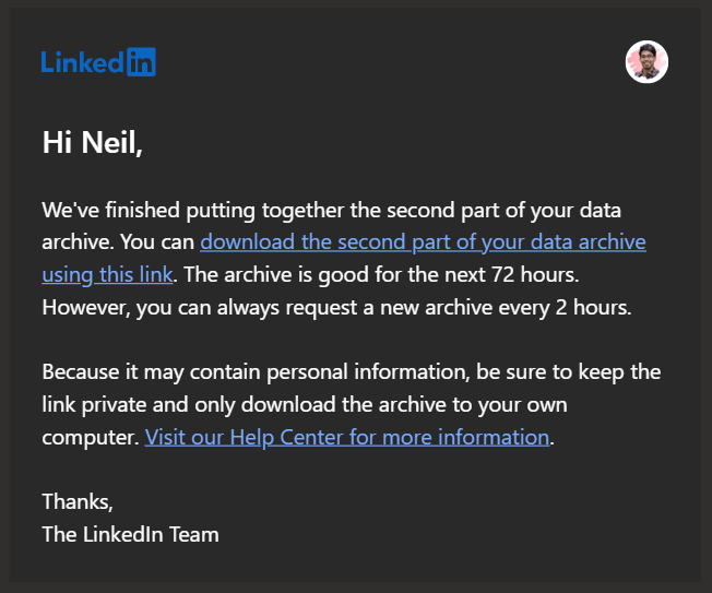
- Password Confirmation and Request Processing: After choosing to download the full archive, LinkedIn will prompt you to confirm the request. According to LinkedIn, an initial email with a partial data set will arrive shortly, followed by the complete data set within 24 hours.
- Download Data: Following the email notification from LinkedIn, you can download the data archive. The data comes in various files, each representing different aspects of your LinkedIn activity, such as messages, connections, and interactions.
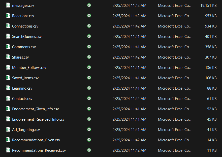
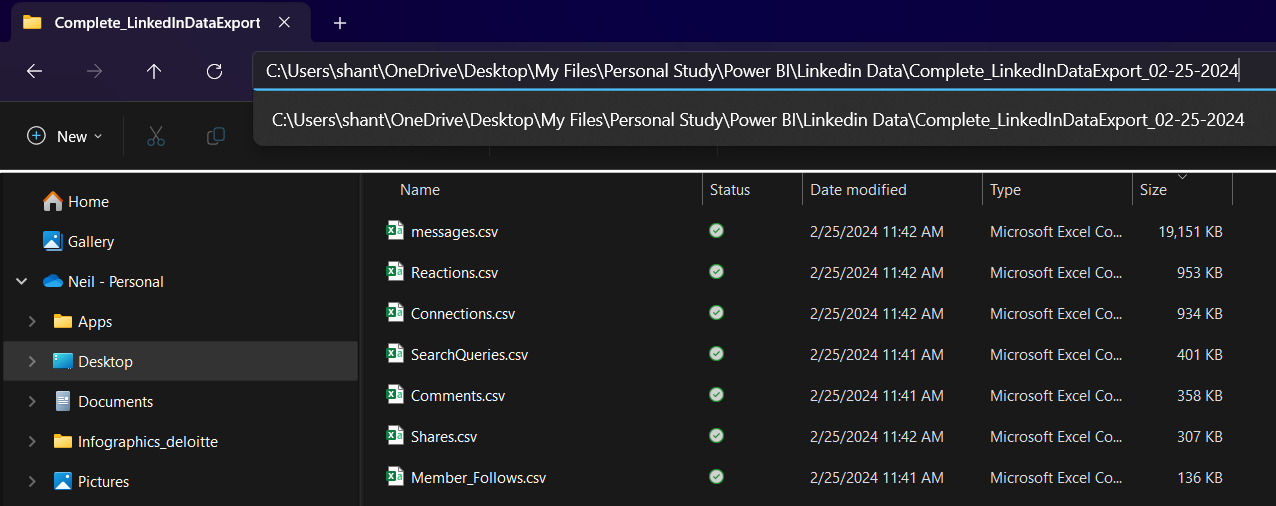
- Explore Contents: When you unzip the folder, you will discover a large number of CSV sheets containing various items. We will be working with a select few, but you are welcome to use the remaining sheets to create an even better report.
- Where's my engagement data!! : After opening the files, you will discover that you do not have the engagement data. LinkedIn!! Why not provide everything in the same zip file? 😑
Anyway, navigate to your analytics area on your profile and select the 'Export' option. Keep in mind that this will only provide statistics for the last 365 days, whereas the other files include the complete history.
If you are unable to find it, use this link.
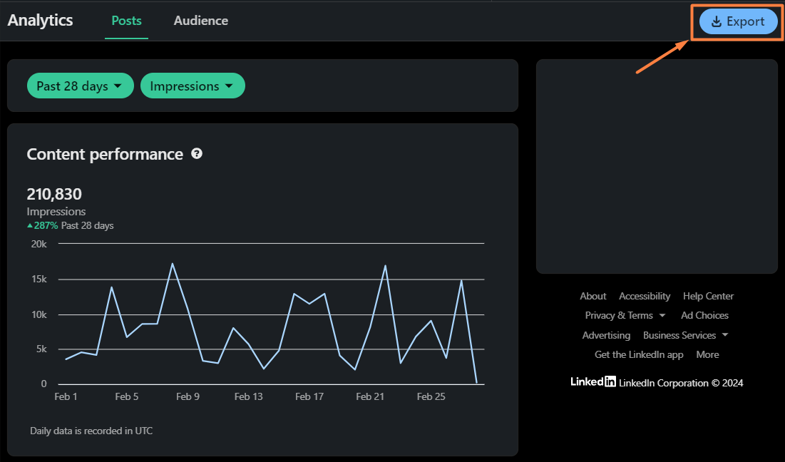
Following is an Excel file that will provide engagement data.
Importing LinkedIn Data into Power BI
Power BI makes it easy to connect to and import LinkedIn data stored in Excel or CSV formats. Here’s a streamlined approach to make this process as smooth as possible:
Open Power BI and Import Files:
Start by opening Power BI Desktop. Head over to the "Get Data" option, select "Text/CSV" and then navigate to and select the LinkedIn data files. These might encompass a variety of datasets including messages, connections, reactions, comments, and shares.
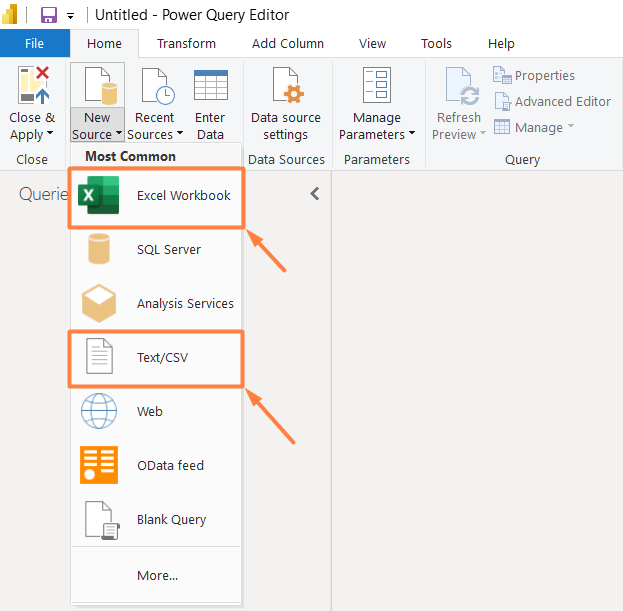
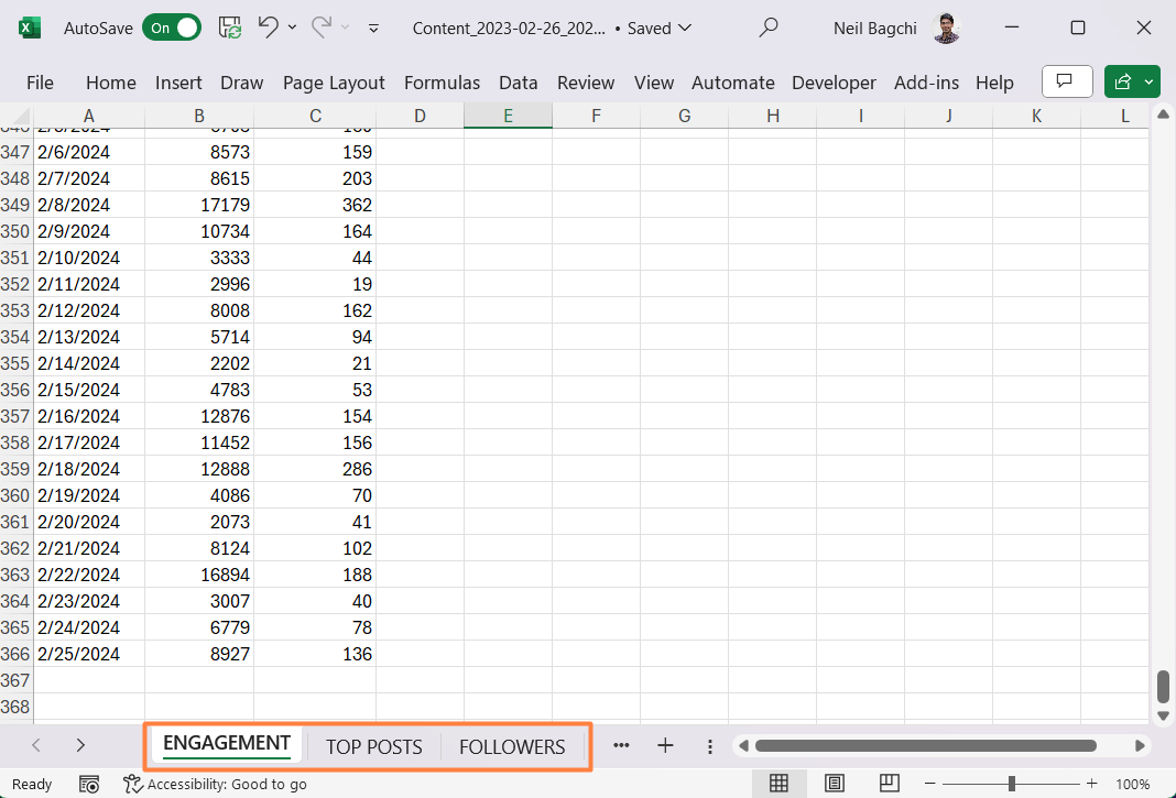
Note that you will need to use the 'Excel Workbook' option for the Engagement Excel sheet. Following are the files that I have imported for my analysis.
Data Cleaning and Transformation:
After importing, it’s common to find missing headers or misformatted dates. Power Query comes to the rescue here, allowing you to clean and transform your data for clarity and coherence. Essential transformations might include setting the first row as headers or splitting and formatting date and time columns.
In terms of the dataset we are working with, all of these cleaning steps are pretty simple. You can find out the specific steps in more detail using the PBIT template file available for download later.
Creating a Calendar Table:
To avoid reliance on Power BI’s auto-generated tables, we will create an explicit calendar table using Power Query. This enhances model flexibility and allows for tailored date-related analysis.
I found the original version of this code from an Enterprise DNA course. However, it has been modified based on my requirements.
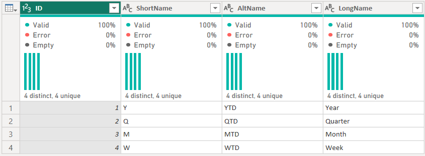
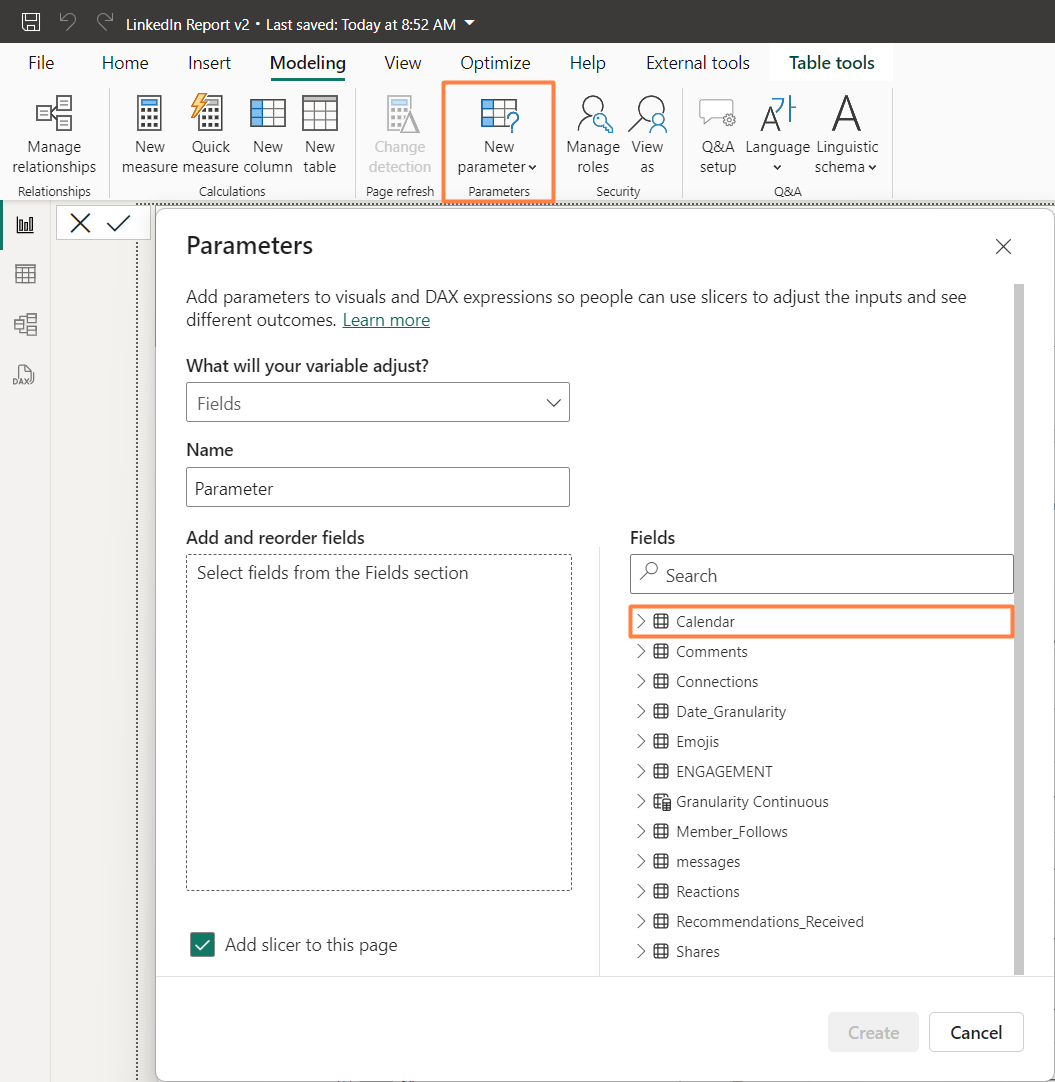
Adding a 'Date Granularity' Table:
Next, we introduce a manual table to dynamically alter the granularity of your analysis (Week/Month/Quarter/Year) using field parameters. This step, while optional for beginners, can significantly enhance your dashboard’s interactivity and user experience. I learned about this from one of Gustaw Dudek's LinkedIn posts (link) and modified it a little.
Note that you will need to manually type the following table after clicking the 'Enter Data' option from the top menu bar.
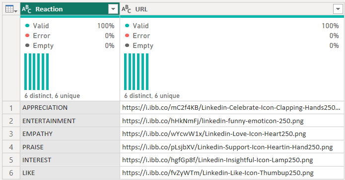
Final step..I promise!! Incorporating an 'Emojis' Table:
For a touch of visual flair, we add another manual table to include emojis or reaction icons relevant to LinkedIn interactions. This involves downloading emojis from this website (link), uploading them to a hosting service like imgbb.com, and linking them within Power BI for a more engaging presentation.
Similar to last one, you will need to manually enter the details using 'Enter Data' option.
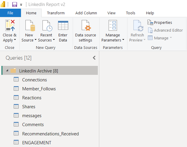
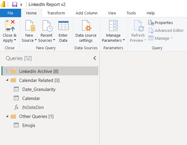
After following all the steps, your Query view will look like the following:
Why does my data model look like an Octopus!!
Once we've tidied up your datasets, establishing relationships between the different tables is our next move. This step is vital for creating a cohesive data model that reflects the intricacies of our professional network and interactions.
My goal while creating this report was to get it done as quick as possible, thus, the data model illustrated here should only serve as a starting approach. For instance, linking data such as connections and messages by the connection name can enable more targeted insights.
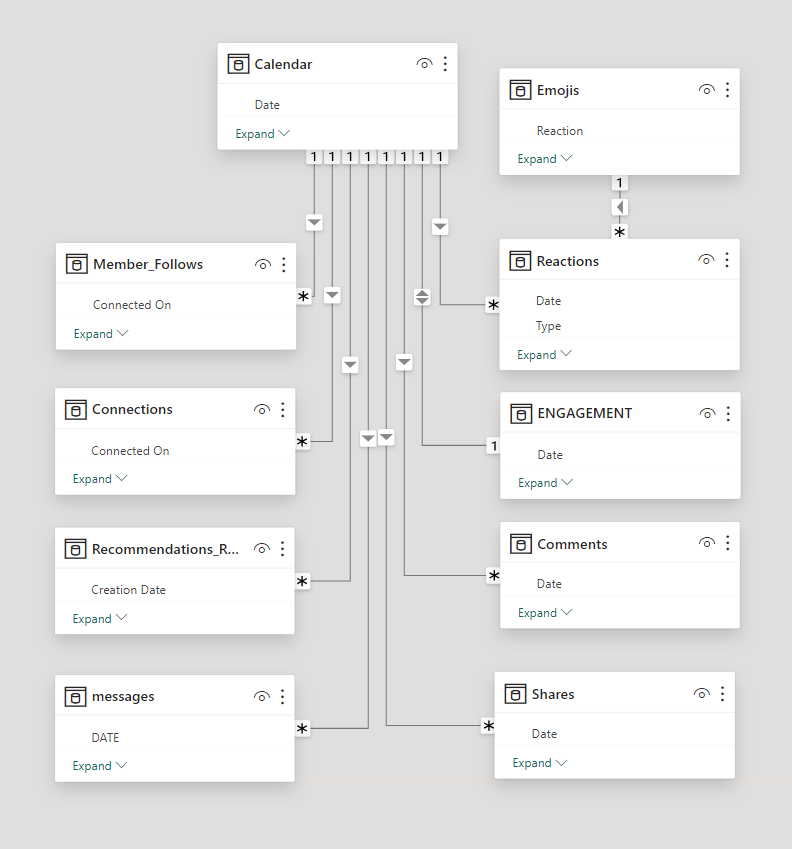
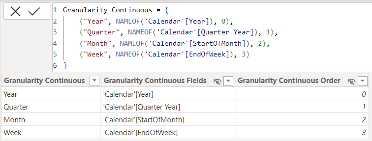
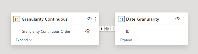
Next, we will create a field parameter called 'Granularity Continuous' by simply dragging and dropping specific fields from the Calendar table—Year, Quarter Year, Start of Month, and End of Week. This parameter acts as a bridge to the previously discussed Date Granularity table.
Create the relationship between the two tables as shown below. This approach is now going to help you play around with the trends and patterns within your LinkedIn activities.
Designing Your Report
A well-designed dashboard communicates information clearly and efficiently. When designing your dashboard, consider which visualizations will best represent your LinkedIn data. Power BI offers a variety of charts, graphs, and filters to make our dashboard informative and visually appealing.
The initial step in dashboard design involves wireframing, a process that can be undertaken with tools such as PowerPoint, Figma, or even traditional pencil and paper. I had clear objectives and insights I aimed to extract from the dashboard. Thus, I opted for a straightforward layout, segmenting the canvas into three distinct sections and placing the important visuals and metrics along a Z pattern to ensure a structured display of information.
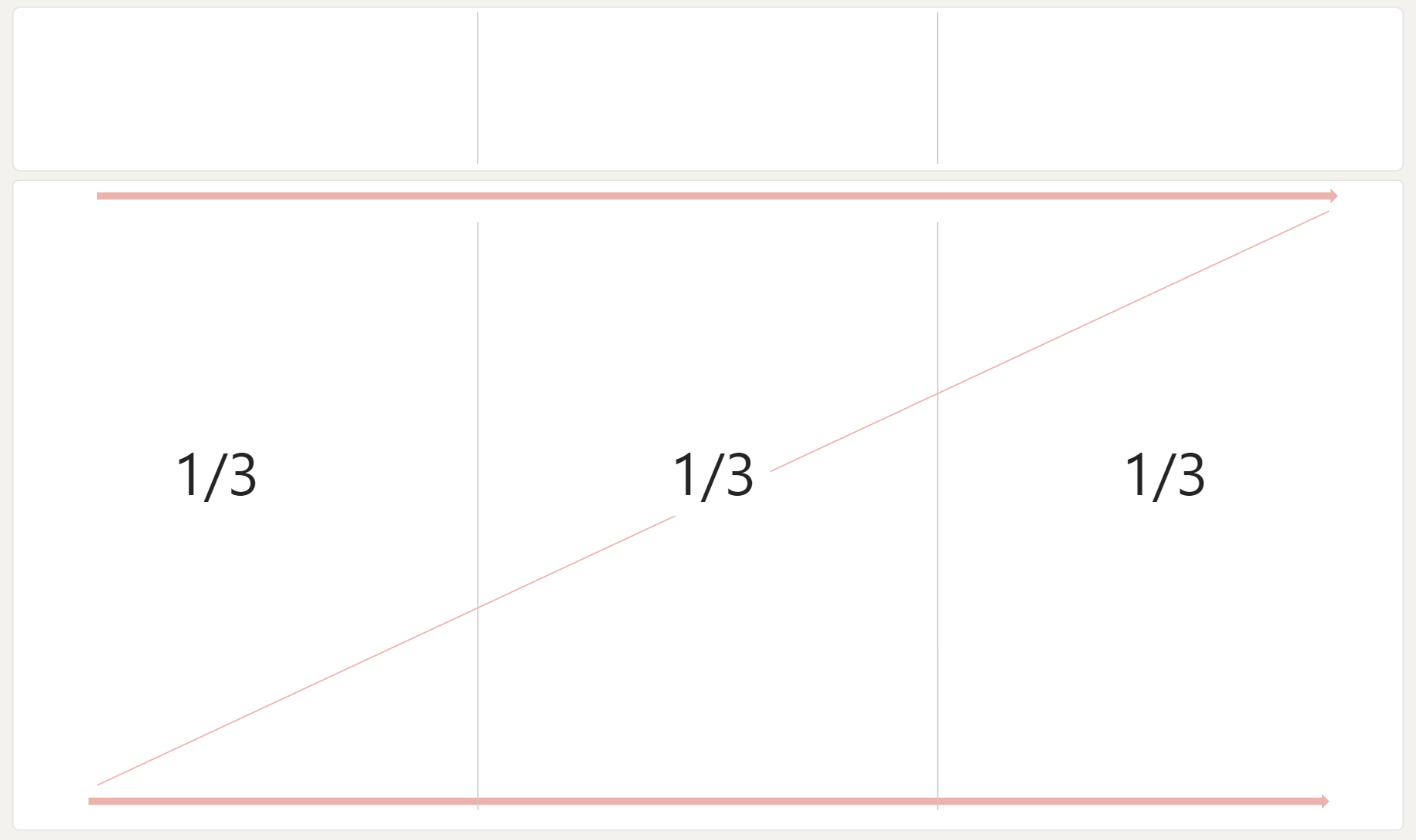
The Z-pattern layout was chosen for its compatibility with normal reading patterns. This pattern closely resembles the typical path used by the human eye when scanning a page. Placing crucial information along this path, particularly in the top row, increases the likelihood of grabbing and maintaining viewer attention.
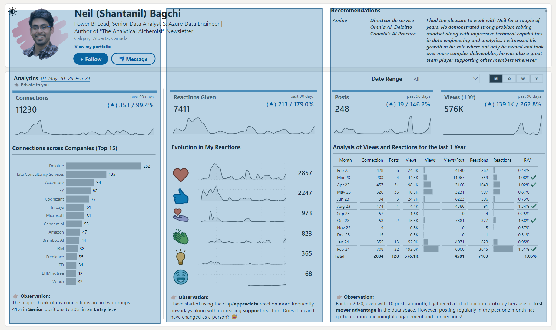
The final version of the report mirrors this structure as well.
Leveraging DAX for custom calculations and integrating advanced visuals can transform your Power BI report. I haven't gone into too complex DAX expressions. However, you are free to expand the functionalities for more complex analysis and customization.
Key DAX Measures Explained:
I have used the same DAX measure template for almost all of the tables.
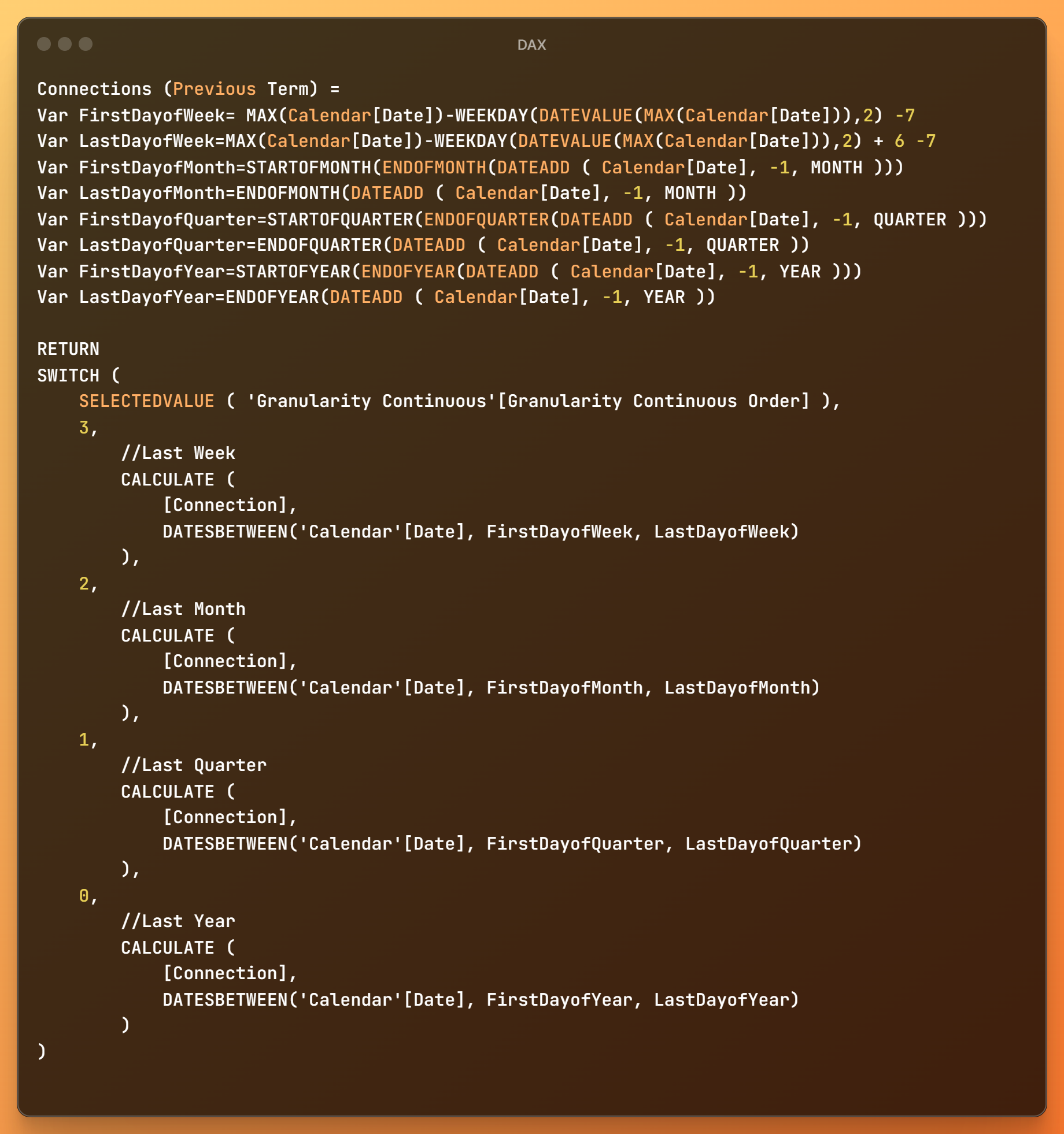
- Connections (Current Term) and Connections (Previous Term): These measures use variables to calculate connections for different time frames (Week-to-Date, Month-to-Date, Quarter-to-Date, and Year-to-Date) compared to their previous periods. This involves dynamic date range calculations to filter data based on the selected granularity, allowing for an adaptable view of connection trends over time.
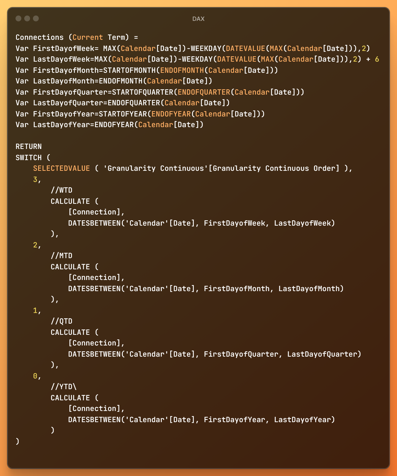
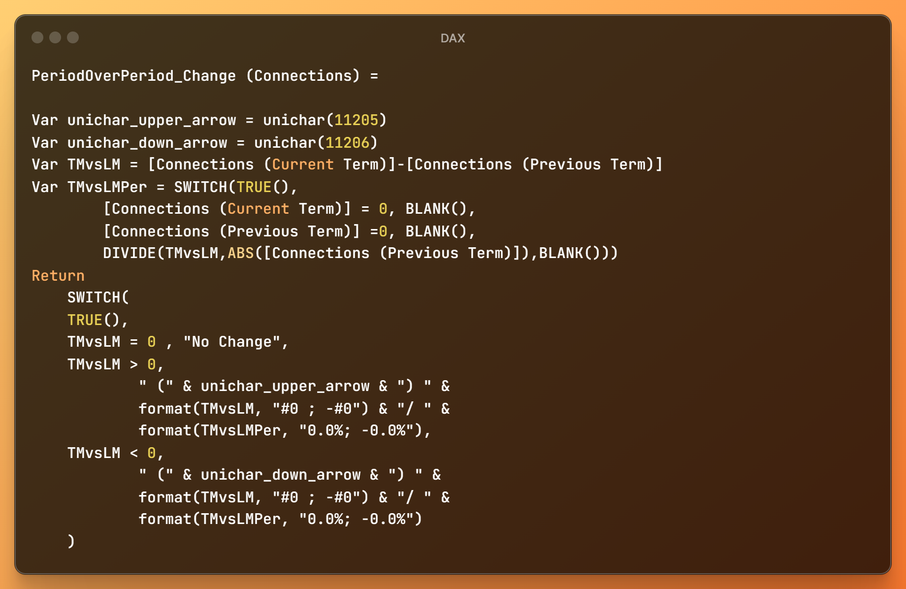
- PeriodOverPeriod_Change (Connections): This measure introduces a visual cue to depict the Period-over-Period change in connections. Utilizing Unicode characters for arrows, it dynamically displays whether connections have increased or decreased, alongside the percentage change. This not only makes the dashboard more informative but also enhances its aesthetic appeal by providing an immediate visual representation of data trends.
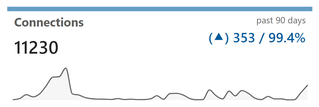
Creating visualizations in Power BI is straightforward. For instance, to create a bar chart of your connections by industry, simply drag and drop the relevant fields into the visualization pane. Power BI offers extensive customization options to refine your visualizations, ensuring they deliver the intended insights. For example, in the following visual, we used the new card visual along with an area chart to create this effect.
I am not going to delve too much into the visualization and storytelling approach as this will require a full post on its own. You can play around with the template file and decipher the various visualizations used.
Downloads
If you don't know what a Power BI template file is and how to use it, kindly check my previous post on Power BI Template Files. This is essential before you download the file and start playing around with it.
In order to use the following file, you will just need to provide the paths of the respective LinkedIn dump that you had downloaded previously. Just go into the folder and copy the path for accessing the files.
For the Excel sheet that stores the engagement data, follow a similar process to extract the path and enter it in the template file.
Conclusion and Next Steps
To keep your dashboard relevant and accurate, regularly update it with the latest LinkedIn data. Also, adhere to best practices for data security and accuracy. I have removed the personnel names and email addresses so that it is not accidently released to the web. In case, you plan to use those fields to create a better report then be wary before publishing it to the web.
This guide provides a foundation to embark on a journey of using personal data for creating your project portfolio. As you become more proficient, explore advanced features and customization options to make your report more powerful.

THANK YOU FOR READING !!
You can check some of my previous posts on XMLA endpoints, REST API, PowerShell cmdlets, Power BI Template Files and Power BI for Business Users.
In case you want to contact me: